Monday, October 22, 2012

Faith

For some reason the issue/theme of faith is still holding strong with me. I suppose it has always been in my sub conscious only now I'm much more aware of it's effect on my work.
This is a piece I started at the workshop with Mary and that I have come close to resolving. I might make some further adjustments to the fish image - perhaps fade it a bit more but first I will set it aside for a few days.


unable to access!

I haven't been able to get at my blog since December and it took this long to straighten everything out - partly because I'm lazy and it seemed like too much trouble!
Now that I'm back, I can start getting caught up. GRRRR and I also need to learn this new setup.
                                                                                                              
After the spring show; An Event Apart, I didn't paint again until October, when I attended a workshop with Mary Todd Beam at Arrowmont in Tennessee with 3 of my good friends; Lauren Everitt Finn, Patty Henderson and Tom Powell. This was my third workshop with Mary. I find her incredibly inspiring. See her work at: http://www.marytoddbeam.com
It was a great week and I painted up a storm. 
Some of the results:


Saturday, December 17, 2011

a few new animals as a respite

Once I finished those abstracts, I had 2 commisions, a bday present and a xmas card to create.
here they are

commission #1
a trio of spaniels - the ones on the left & right are departed
watercolour10 x 16


a xmas present - had some trouble with the photos so painted 2 and forgot to take a photo of the second before they were picked up
watercolour, 8 x 10
,

and then the birthday present - 10 x 14, watercolour - "crooner cat" for Leo


last, my Xmas card - my cat sitting in my garland also 10 x 12

Wednesday, November 9, 2011

continuation of a theme

Prayers

I decided that my original concept have merit for continued exploration. This time I wanted to enhance the stained glass effect of my original drawing so I used heavy black lines to break up the picture plane. I also kept these vertical as another contrast to the 1st series.
here are the 3 results

this one is 21 x 34 acrylic on canvas


16 x 30 acrylic on canvas


16 x 30 acrylic on terraskin

Monday, October 31, 2011

and another one

This is another one in the series I'm doing but it's a huge departure in terms of the colour. I am and have been struggling with it all week - it might be close to resolved now so I will let it sit for a few days and see how I feel then.

24 x 48 acrylic on canvas

Friday, October 14, 2011

and continuing the series ....

This is the next one - 24" x 48" Golden acrylics and gels
Again I find myself wanting to stop here ... not really convinced that it's finished but will let it rest for now.

Wednesday, October 12, 2011

some revisions and titling problems

The more I kept looking at the vertical painting I posted last, the less I liked the purple! Today I tried some over painting with blue - didn't work; orange - ugly; Payne's grey - didn't work and finally burnt umber with a touch of black to deepen it. This time I think it's better - still letting it sit.


I also worked on this second one to resolve composition issues - I had split the bottom area into 4 fairly equal sized areas - merged 2 and like it better.


Now to the naming/titling of these! I have been feeling really energetic and high on life so all these paintings share that connection. I have been tossing around the following title ideas:

Dances with a Brush
Brush Dances
Dancing with Life
Brushes with Life

These would be a series numbered from 1 to however many I get done! I hate coming up with titles!!!
Any suggestions?

Saturday, October 8, 2011

a very unusual last few months!

Well, after the rains cleared and I got back to golf .... health issues interfered and I ended up in hospital for emergency surgery! 3 weeks in hospital were followed by another 3 weeks gaining back some strength - not the weight though - that was the good part - lost 24 lbs and am keeping it off.
Interestingly, I became quite energized and started several canvases. I do have a large commitment for the spring so it's a good thing I seem to be inspired.

the next 2 paintings are complete and await titles .... groan - the hard part.

this one is 27" square, acrylics, pastels and gel mediums


24' x 30"; same materials


and now shots of my studio with the rest of the prepped canvases.


Monday, May 23, 2011

No 2 in the series

I decided to re work the second one - the colours just didn't work - too peach/beige
I added further texture mediums and tinted it with white gesso. I had already decided that the colours I wanted were copper and turquoise so once everything settled - including the rain therefore no golf - I went back to work on this. I am liking it so far but will let it sit for a few days before I sign & varnish it.

Friday, April 29, 2011

continuation of a theme

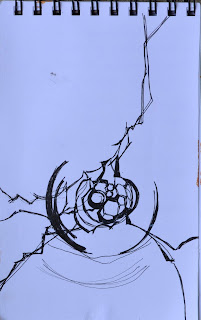
This all started because I have a beautiful piece of glass hanging in my family room window. The shapes and lines have always intrigued me so I did a somewhat loose sketch of it - planning on using it as a springboard for a painting.
I often work on top of previous paintings that I am not fond of and that's how the first one evolved. (posted Tuesday)

the glass piece & the sketch


the second one - today

I wanted to continue working with the original layout and see what moods variations of colour
would give me. I had wanted to do warm red/browns & coppers with turquoise
accents, so to start (this was very blue underneath) I put in some of the colours very wet! I decided it was too messy - particularly since the original painting still showed - so I used watered down gesso to calm it - instead I got this muted combo and now I'm somewhat baffled!
Another issue is that I was so far into the doing of it, that it didn't occur to me to change the composition!!!


and to add to the confusion - I have 2 more set up - vertical comps this time

Tuesday, April 26, 2011

2 done - I think!

I think the both of these are resolved, but now I will wait to see what my critique buddys Lauren & Patty have to say about that ...... lol


I took them outside to photograph - it is really bright and sunny today - amazing how they look different in sunlight. Now the top one looks just a bit garish ........


Monday, April 25, 2011

another begining


22" square acrylic on canvas

Another square canvas that I needed to revise - I added some linear texture elements; wiped back most of the under colour with thinned gesso & nickle azo gold and added some compose blue to highlight the linear bits. Now it needs to sit for a bit while I analyze the current condition. Already the large bluish top left is bothering me.

Thursday, April 21, 2011

new take on a previous start


22" square, acrylic on paper

I had started a loose macro of a double hibiscus about a year ago and pulled it out again last week - needing inspiration. I decided to add some strong linear contrasts after reading Jan Sitt's book titled "TEXTURECOLORFEELING". I had some subtle textures going on already and wanted to see what increasing the darks would do. Now I'm letting it season - I might increase the hue saturation on some of the petals eventually - but I will let it sit for a bit.

Thursday, April 7, 2011

finished!


the client is satisfied and so Emma is done. Turns out she wanted the name off to the right side - so another scrub and change. Good thing this paper could handle it!
Finished portrait; 9 x 11 watercolour on Fabriano Artistico 140lb

chchch changes ......

After the client viewed the progress photo, she had some changes to suggest
- smaller, greyer nose - I think the grey is okay - but I couldn't get it too seem lighter and smaller
- close up the mouth & lighten it up
- no tags
- some apricot notes on the body
- add her name at the bottom
changes made - we'll see if she approves

next steps


I worked a bit more on the areas I had mention - added the dog tags; changed their positioning; added and altered the background - the client asked for beige/rose - I will need her take on this before it counts as done.

I will have to take a good look at it since it looks a lot more pink/warm then I thought ..... hmmm

Wednesday, April 6, 2011

the beige dog


This is Emma so far - I'm having a bit of trouble keeping her light - her mom wants a beige/rose background and I'm afraid she will disappear.
I still need to complete the nose, refine the eyes, paint her collar and tone down some of the values on the left.
I probably will mute the tags too - don't want them to be in conflict with the eyes.
So - did I get the smile?

Tuesday, April 5, 2011

next on the easel ....

It's time to get back to pets. I have a new commission for a cockapoo named Emma who died recently and I hope to have tomorrow to get going on her. My favorite pose is not the one the owner picked. Not surprisingly she wants an upbeat look - a smiling Emma - so I will do a composite of the different photos I have to work with.

this is Emma in my favorite pose - she looks adorable here


This is the smile I will use


and this will be the pose