Monday, May 23, 2011

No 2 in the series

I decided to re work the second one - the colours just didn't work - too peach/beige
I added further texture mediums and tinted it with white gesso. I had already decided that the colours I wanted were copper and turquoise so once everything settled - including the rain therefore no golf - I went back to work on this. I am liking it so far but will let it sit for a few days before I sign & varnish it.

Friday, April 29, 2011

continuation of a theme

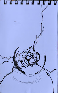
This all started because I have a beautiful piece of glass hanging in my family room window. The shapes and lines have always intrigued me so I did a somewhat loose sketch of it - planning on using it as a springboard for a painting.
I often work on top of previous paintings that I am not fond of and that's how the first one evolved. (posted Tuesday)

the glass piece & the sketch


the second one - today

I wanted to continue working with the original layout and see what moods variations of colour
would give me. I had wanted to do warm red/browns & coppers with turquoise
accents, so to start (this was very blue underneath) I put in some of the colours very wet! I decided it was too messy - particularly since the original painting still showed - so I used watered down gesso to calm it - instead I got this muted combo and now I'm somewhat baffled!
Another issue is that I was so far into the doing of it, that it didn't occur to me to change the composition!!!


and to add to the confusion - I have 2 more set up - vertical comps this time

Tuesday, April 26, 2011

2 done - I think!

I think the both of these are resolved, but now I will wait to see what my critique buddys Lauren & Patty have to say about that ...... lol


I took them outside to photograph - it is really bright and sunny today - amazing how they look different in sunlight. Now the top one looks just a bit garish ........


Monday, April 25, 2011

another begining


22" square acrylic on canvas

Another square canvas that I needed to revise - I added some linear texture elements; wiped back most of the under colour with thinned gesso & nickle azo gold and added some compose blue to highlight the linear bits. Now it needs to sit for a bit while I analyze the current condition. Already the large bluish top left is bothering me.

Thursday, April 21, 2011

new take on a previous start


22" square, acrylic on paper

I had started a loose macro of a double hibiscus about a year ago and pulled it out again last week - needing inspiration. I decided to add some strong linear contrasts after reading Jan Sitt's book titled "TEXTURECOLORFEELING". I had some subtle textures going on already and wanted to see what increasing the darks would do. Now I'm letting it season - I might increase the hue saturation on some of the petals eventually - but I will let it sit for a bit.

Thursday, April 7, 2011

finished!


the client is satisfied and so Emma is done. Turns out she wanted the name off to the right side - so another scrub and change. Good thing this paper could handle it!
Finished portrait; 9 x 11 watercolour on Fabriano Artistico 140lb